
Redesign an Intuitive Information Architecture & Engaging Responsive Web Experience for Variable West September - December 2020
Variable West is first website platform that provides a comprehensive calendar of art events on the West Coast of the United States. The project leverages research insights from interviews and questionnaires to revamping the web experiences for the client Variable West in a responsive design, through the use of personas, storyboards, wireframes, prototypes, and enhanced information architecture.
Client: Variable West
Duration: 12 weeks
Location: Remote
Design Tools: Figma, Optimal Workshop
Teammate: Aichen Guo, Yifan Wang, Leo Zhang
My role:
-
Research & Analysis: questionnaire, interview, affinity diagram, persona, card sorting, tree testing, competitive analysis
-
Design: information architecture, paper prototypes, medium- and high-fidelity prototypes of membership and personal account pages
Introduction
PROJECT TIMELINE

ABOUT THE CLIENT
Founded during the chaotic summer of 2020 by Portland-based writer and editor Amelia Rina, Variable West aims to increase engagement with the West Coast art world while nurturing both regional communities and international conversations. The vision of Variable West is to become an essential resources for writers, artists, curators, and other art lovers to find art events they want to attend.
Though with great vision, the existing website required a lot of improvements. Since the organization was still in a starting stage, the platform needed to attract new visitors and secure old users to have more users donate and support the website. Therefore, they wanted designers to redesign their website for both mobile and desktop versions.


Screenshots of Current Website, Desktop Version
TARGET AUDIENCES

Both groups are our potential users of Variable West since they are likely to search for art events or post new event information. They are also potential promoters who are likely to recommend the events to others and go with their friends. Thus, both groups are essential to our research in learning user preferences for an art event website.
DEFINING GOALS
Based our kick-off meeting with the client, there are two main goals we want to achieve:
-
Attract new visitors including both event organizers and art visitors
-
Increase users' return rate by enhancing the interaction between users and the website
User Research
QUESTIONNAIRE
Sample size: 76 responses (33 art professionals and 43 amateurs)

INTERVIEWS & OBSERVATIONS ON WEB WALKTHROUGH
Sample size: 6 interviewees (2 art professionals and 4 art visitors)
Affinity Diagram:

After gathering information from questionnaire and 6 interviews, we used affinity diagram to organize all the information and gain insights from our research. We firstly put key info from questionnaire and interview on sticky notes using Miro, then grouped them together into five main categories, and at last made a summary of each group.
KEY RESEARCH INSIGHTS
-
Both visitors and art professionals prefer an art event website with personalized information regarding their location, preferred time, and categories.
-
Visitors would like to go to art events and pay more if it has artists or themes they like.
-
People enjoy reading well-organized websites that have many pictures instead of heavy texts.
-
Both visitors and art professionals prefer using SNS as a way to gain information and advertise art events.
-
People's top 3 favorite ways to support artists or events are buying souvenirs, purchasing tickets, and sharing art events.
Design Strategies
By 1) optimizing the current digital experience for visitors and 2) bringing new ideas, we want Variable West to resonate with users' true needs, reach to more people, and eventually drive business growth.

PERSONA
Based on user research and design strategy, we came up with 2 personas to have a better idea in mind who we are designing for.
1. Art visitor:
They use the website for exploration without a clear idea of which event to visit, but they usually have preferred time and location in mind. They value attractive visual design, personalized recommendation, effective filtering, and the sharing feature.

2. Event organizer:
They use the website for posting their curated art shows as well as discovering new events. They value the organization of the platform, effectiveness of sharing, and information on diversity and accessibility.

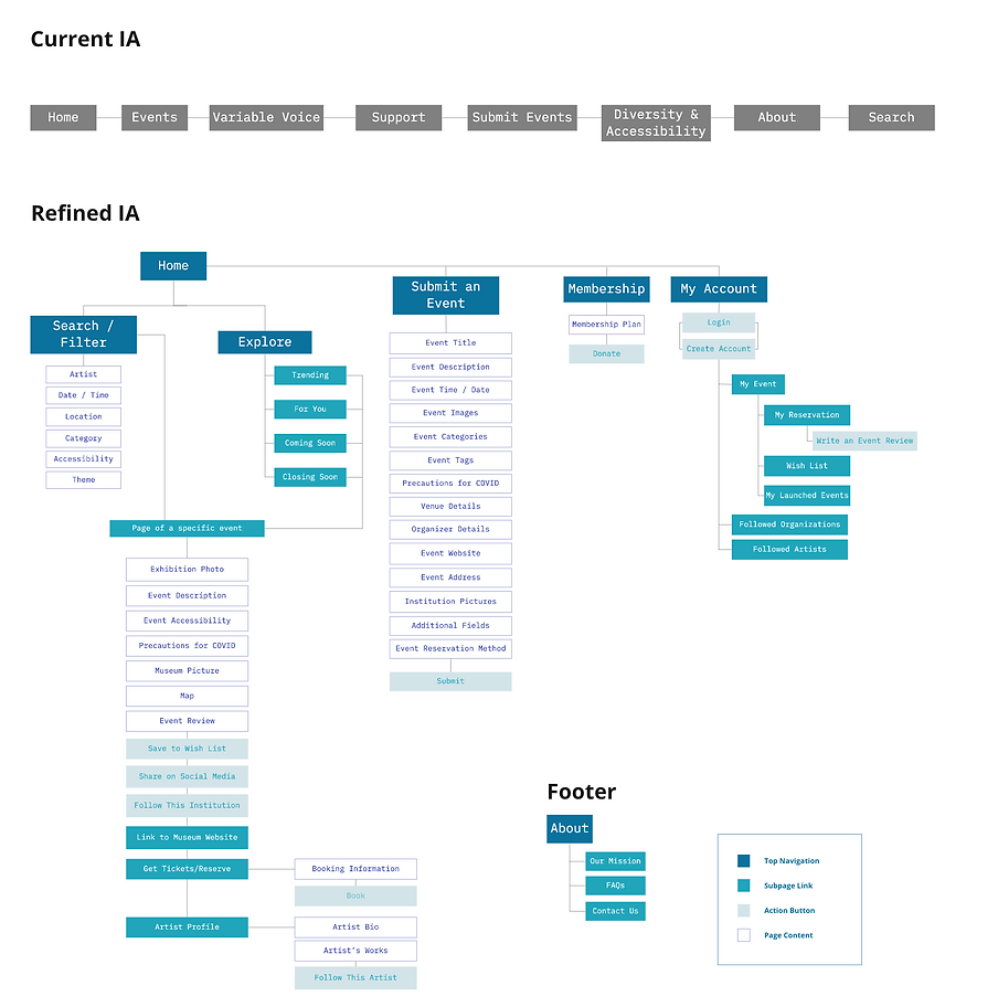
Site Map Revision
CARD SORTING
Using Optimal Workshop, we created 46 cards and six main categories including "Home Page", "Event Page", "About", "Support Us", "Submit an Event", and "My account" for card sorting.

After collected card sorting results from 11 participants, we firstly used the standardization grid function to sort card ranking for each category and put cards that the majority (number>7/11) has agreed on in the tree testing model. Then, we analyzed the results of the controversial cards and summarized our findings:
-
The agreement rates for four categories are under 40% which is relatively low. Possible reasons are that the wording of cards is not accurate enough and some cards may fall under multiple pages (e.g. calendar may fall under both "home page" for searching and "My account" for documentation).
Therefore, we revised the wording of the controversial cards and put some of them under multiple pages to improve the navigation of information for tree testing.
TREE TESTING
We developed 5 tasks for the tree testing with an aim to ensure accurate navigation for "search", "submit an event", "saved event", "precautions for COVID19", and "write a review".

We've collected results from 7 participants for the tree testing:
-
The navigation success for "submit an event" is very high (6/7) due to few layers.
-
While we expect participants to choose "search date/location" when they were asked to find an art event in San Francisco next weekend, all of them choose "Explore" which also makes sense in this case.
-
When participants try to find "precautions for COVID19" in tree testing, many selected "About" and "Home page" instead of the "Event page" expected by us. We think the participants may not fully understand the nature of the website that it collects events held by various institutions rather than a specific institution's events page.
-
4/7 got confused about where to find the "saved events" possibly because the wording may indicate the event section. Thus, we revised the wording to "wishlist".

Our key insight from the tree testing is that some functions under multiple layers are not intuitive enough, so we further revised the wording and simplified the hierarchy.
REVISED INFORMATION ARCHITECTURE
Competitive Analysis
What we did: Conducted competitive review of 4 events-related or art-related websites across 6 criteria including homepage features, navigation, search, categories, visual, and the for event organizer section.
Objective: To establish guidelines for Variable West's design by analyzing the pros and cons of benchmarking art-related websites and their information architecture.

WHAT WORKED
-
Navigation bar that has intuitive categories and a short dropdown menu for each if needed
-
Search that includes filters of events categories, time, location, price; it's even nicer to provide suggested keywords when users type and a map function that indicates the events' locations visually
-
Homepages that give personalized recommendation, featured categories, time & location of the events, free/ get tickets icon
-
Updated data with clear insights on published events for event organizers
-
Interesting and consistent visual standards, animations, and wordings
WHAT DIDN'T WORK
-
Pages for event organizers that are usually too hard to find.
-
Wordings for navigation bar that are sometime too board or vague to understand.
-
Navigation bars that require an extra click to view subcategories
Wireframing & Iteration
PAPER PROTOTYPING -- DESKTOP VERSION

PAPER PROTOTYPING -- MOBILE VERSION

USER TESTING
We conducted moderated user tests on our interactive paper prototypes. We invited 7 users and took notes while we were testing. At last, We concluded with 5 usability problems and provided recommendations respectively for our later medium-fidelity prototype design.
-
My wishlist needs consistent visual recognition. A user suggests that when finding the wishlist he saved, adding some visual recognition would be helpful for navigation. Thus, we should add a heart logo in front of the My Wishlist tag so that it matches up with the heart logo on the event page.
-
A go back button is needed on both mobile and desktop versions. Two users had the problem of going back to the previous page on the event page. We should add a return button on the event page so that the user can go back.
-
A unique visual standard is needed. When we design our medium-fidelity and high-fidelity prototypes, we should try to differentiate the visual style in fonts, color, icons, shapes, etc.
-
My Page button will be better with a drop-down menu during the hover state. To improve, the main menu under My Page could be shown in a drop-down menu and more specific information could be shown on the new page when clicking a menu category.
-
The visual design of the calendar could be improved. Therefore, we decided to replace the calendar with an eye-catching box with texts of "select a date range" on both desktop and mobile versions to make the filtering date function accessible and visually pleasant. When users click on the "select a date range" button, a calendar would then be expanded for users to choose.
MEDIUM FIDELITY PROTOTYPES -- DESKTOP VERSION
We revised paper prototypes and developed mid-fidelity prototypes based on user testing. At this stage, we standardized fonts, text-indent, size, and icons. We also redesigned the calendar feature and filled in event information to see if the visual layout is appropriate.

MEDIUM FIDELITY PROTOTYPES -- MOBILE VERSION
After testing on phone, we decided to show two recommended events in a row.

UI GUIDE

Final Prototypes
COMPARISON
Homepage

Event Search
Event Page

Membership Page
RESPONSIVE DESIGN

Personal Account Pages

Mobile Mockups
INTERACTIVE PROTOTYPES
Click the image below to experience the DESKTOP VERSION!

INTERACT with the Variable West MOBILE VERSION!

Outcomes
THE CLIENT WAS IMPRESSED!
"Your work is way beyond my expectation! I'm very impressed with the findings and prototypes. I love the horizontal display of categories which prevents excessive scrolling for long paragraphs. The scroll block on the event page is very smart! I also like the wishlist (heart) function and the ability to follow artists & organizations; establishing personal profiles (reservations, wishlists, follow artists & organizations) effectively increases more interaction on the site! I was worried that “Support” does not convey the message of donation well. After listening to your research and findings, I agree that “membership” does work better."
