
Improving Efficiency and Satisfaction of User Experience for the Met Website with Eye Tracking Analysis December 2021
The Metropolitan Museum of Art is one of the world's largest and finest art museums. The Met presents over 5,000 years of art from around the world for everyone to experience and enjoy. Using Tobii Eye Tracker to observe the position of the eye on the interface, this project analyzes users’ eye attention on the Met website, focusing on its Exhibitions, Events, and Primers pages, in order to understand how people are interacting with the site. To make interactions more accessible and satisfying for users, we provided recommendations for page layout, interactive elements on exhibitions and events, and for navigation on the Primers page.
Client: The Met Design Team
Duration: 4 weeks
Location: New York, NY
Method: Eye Tracking Analysis
Teammate: Aichen Guo, Wicky Wu, Ali Ciftci,
Preet Gangrade, Verena Tanzil
My role:
-
Moderated 2 eye-tracking sessions
-
Led the team to organize, summarize, and analyze findings using affinity diagrams together
-
Created recommendations and decking for the Exhibitions section
How to analyze a website's performance using eye-tracking?
1. IDENTIFY RESEARCH METHODS & METRICS

Metrics
-
Effectiveness: the accuracy and completeness with which users complete certain goals.
Task completion (yes/no), accuracy (error rate, precision), recall, task completeness, quality of the outcome
-
Efficiency: the resources expended to complete those goals.
Task completion time, input rate, mental effort, use frequency, learning time
-
Satisfaction: the users’ comfort with and positive attitudes toward the system.
Standardized questionnaires, preferences, general satisfaction, attitudes
2. GENERATE RESEARCH QUESTIONS
We intend to evaluate the effectiveness, efficiency, and satisfaction of user experience in Exhibitions, Events, and Primers aiming to have a better understanding of the following research questions:
-
How do users consume and engage with textual and visual material on exhibitions and primers?
-
How do users find events that are tailored to their specific needs?
-
How do users interact with the immersive multimedia content on primers?
3. RECRUIT PARTICIPANTS & DESIGN TASK SCENARIOS
Participants
Due to the institute's policy restrictions and health concerns, we were only able to recruit participants who have access to the Pratt campus, including graduate students and undergraduate students at Pratt and staff at Pratt. Yet, all of them are potential visitors of the Met who are likely to use the Met website. Moreover, due to constraints of the Tobii eye tracker, all participants cannot have eyesight issues or wear glasses.
Task Scenarios
The following tasks were designed to gain insight into a user experience using the Met website and to identify the issues they would potentially face.
Homepage
Task 1: On the homepage, find out what exhibitions are currently on at The MET without moving on to other pages.
Exhibitions
Task 2.1:Find an exhibition related to Japanese culture and then find a vase/jar(artwork) from this exhibition.
Task 2.2: Find an exhibition that you would like to see in person at the MET and find three objects from this exhibition that are interesting to you.
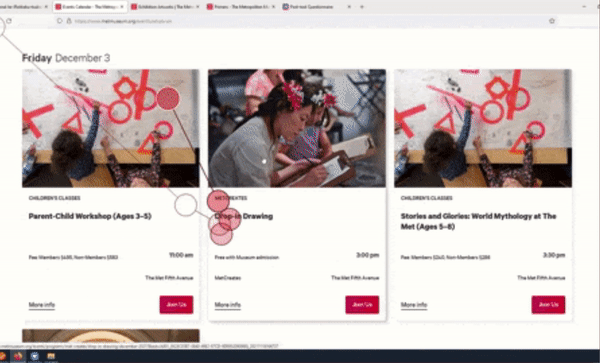
Events
Task 3: Find an event that targets children and takes place in January at the Met Fifth Ave.
The Primer
Task 4.1: Find a primer associated with music and find the Beatles poster from this primer.
Task 4.2: Find a primer that you feel interested in, explore this primer, and see if you can find something interesting to you.

4. USER TESTING WITH EYE TRACKING
To capture and collect data during this study we used an eye tracker tool called Tobii Pro Lab which accurately captures and tracks users' eye movement. With this tool and the setup shown in the picture, we were able to observe and understand where and how users are looking.
After the participants go through the task scenarios, we also conducted a Retrospective Think Aloud (RTA), in which participants watch a video replay of their gaze and explain the thoughts and feelings they had at the time. RTA helps preserve natural behavior at the moment and gives access to a person's motivations with more accuracy than plain reflection.
Setup: Participant is sat steadily facing the main monitor; Moderator sits at the side to the participant, Observer sat further by the side to observe facilitator's monitor and take notes
Test Result Overview

We have a total of 10 participants from students and staff who have been to the MET and have experience going on museum websites.
We asked the participants to go through 4 standardized tasks and 2 free exploratory tasks in order to capture more qualitative data.
During the test, 100% of participants finished the tasks successfully; 60% of participants found the various functions in the website were well-integrated; 80% of participants said they will use the website frequently after exploring it through the tasks.
After all the tasks, participants were asked to rate their experience using a system usability scale (SUS). And the result is 78.3, which is a very good score when above 80.3 means excellent. Yet, there is still room to improve for usability.
The following section will discuss the detailed positive feedback and improvement areas by pages - Exhibitions, Events, and Primers.
Exhibitions - How are users' experiences of finding out current exhibitions at the Met?
1. POSITIVE FEEDBACK - EASY NAVIGATION, ATTRACTIVE COVER IMAGES

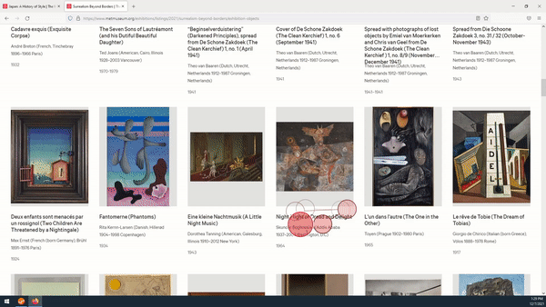
Participant's eye-movement on the Exhibitions page
First, we received a lot of positive feedback regarding navigation and cover images.
All participants think finding out what’s currently on either through the homepage or navigation bar was easy.
We noticed that users’ eyesight generally follows the order of image first, then title, and details at last. Users’ eyes gaze on the big texts on the images last the longest. That makes cover images especially crucial to the Met’s page.
Therefore, the met did a great job as all participants provided positive feedback about the cover images. Almost everyone clicks on the image to access the exhibition page
2. INCONSISTENT EXHIBITION LAYOUT CAUSES CONFUSION

A participant's comment about the Exhibition page
When users reached the section where there is a blank exhibition card and the background color is different, users either thought they reached the end of the page or they feel confused. As one participant said, “I wasn’t sure is this still the exhibition? The grey background made me think it was something different but they are actually exhibitions as well.”
-- Recommendation: Make exhibition layout consistent and eliminate blanks

Current Design
Recommended Design
As shown in the mockup on the right, we filled in the blank space with an exhibition card and change the grey background color to white to make the exhibition layout consistent and reduce confusion.
3. OPENING UP A NEW OBJECT PAGE DISRUPTS THE FLOW OF BROWSING OBJECTS

Participant's eye-movement on the object page
When users want to look at details of an object, the link would take them to a new page and users have to click the “back” button to go back, which can disrupt the flow of continuing browsing objects.
-- Recommendation: Enable pop-up window for object information

Current Design
Recommended Design
As shown in the mockup, when users want to take a close look at the object, it would firstly open up a pop-up window to show general information/story about the object. This way users can easily go back and continue browsing the objects. If one wants to view more details, they can click on the "learn more" button to access more information.
Events - How do users find events tailored to their specific set of needs?
For the Events section, we started with the objective of finding out how participants were engaging with the event page. We wanted to study how participants would look for a specific event catered to their needs. From the findings, we found out that participants were able to complete the tasks however there is a lack of flexibility to accomplish their task.
1. POSITIVE FEEDBACK - EVENT PAGE WORKED AS INTENDED & EASY TO NAVIGATE
All of the participants were able to finish the task without any issues.
Participants agreed that the thumbnail was helpful to find the information that they were looking.
Participant's eye-movement on the Events page
2. FILTER WAS NOT NOTICEABLE AND LABELS WERE VAGUE TO INTERACT WITH

Filters on the current Event page
Out of 10 participants, only one participant noticed the filter without being prompted and used it to find the intended event.
Most participants prefer to click on the next week's button instead of using the filter feature. Some users prefer to scroll down to the bottom of the page to find the next week button.
-- Recommendation: Restructure filter’s menu

Current Design
Recommended Design
Therefore, we suggest displaying the filter unfolded on default to make users more aware of the filter. And to avoid confusion with the menus on the filter, we suggest switching the menu.
3. INFORMATION ON THE EVENT'S CARD WERE NOT DISTINGUISHABLE
Even though the content needed to know where and when the event is going to be conducted was already on the cards, participants were not aware of it. Participants mentioned that they needed to click on the event first to know the detailed information about the event.
The design is not very intuitive for participants, and the layout of the cards is taking a lot of space of the page which caused excessive scrolling.

Filters on the current Event page
-- Recommendation: Make the cards smaller

Current Design
Recommended Design
In order to save some space and to avoid excessive scrolling, we suggest changing the grids from 3 columns grid to 4 four columns grid.
Primers - How do users consume and interact with the textual and visual material presented in a primer?
1. POSITIVE FEEDBACK - INTERACTIVITY, CREATIVITY, & ENGAGEMENT WORKED WELL
8 out of 10 participants have reported that they loved either the interactivity or the content organization of the Primer section.
Participants reported that primers offer an interesting way of telling stories. Sometimes they thought primers are just a polished way of presenting the exhibitions or exhibition objects. One participant said that, “[Primer pages] seems to offer more context historically, culturally.”

Primers page
Positive Feedback Reels
2. THE NAME & NAVIGATION OF "PRIMERS" ARE NON-INTUITIVE
The name “Primer” was neither understood by nor suggested the intended meaning for the users. None of the users have understood what Primer means at first sight. Even after reading the definition, there was not a consensus among the users about what it could mean. One participant said, "Primer is either an introduction to a collection or an educational thing"; another participant said, "I did not know what Primer's were and I still don' fully understand."
-- Recommendation: Making the Primers page more discoverable, justifying or changing the name
First of all, we have to talk about where Primers are on the website. All of the users have reported that they wouldn’t be able to find the Primers. We as a team have assumed that they were purposefully hidden from the users for now as a new feature. So if that is not the case, we have to place the Primers in the navigation bar or make them findable on other pages.
Another suggestion would be about the name: Primer. None of our users have understood what it means, or what it can mean before reading the definition. Some users were still puzzled even after reading the name primer. We therefore suggest, either justifying the name primer by explaining it more clearly or changing the name to something else as users have leaned on names around exhibitions, backgrounds, etc.
3. BROWSING THE PRIMERS CONTENT REQUIRED A LOT OF ATTENTION

Participants found it hard to track the flow of primers. 5 out of 10 participants have either reported that they are having a hard time following the content or they have had a hard time by being unsuccessful to find the desired image, or by ending up outside of the primer still thinking they were on the same page.

In addition, the number of interactive elements was sometimes overwhelming for the participants.
Reels about Primers' findings
-- Recommendation: Make content navigation more prominent to reduce cognitive load

Current Design
Recommended Design
As reported before, users liked interactive elements a lot but the number of interactive elements overwhelmed the user as they’ve scrolled through content. Therefore, we suggest making the content navigation more prominent in the primer pages. We believe a more prominent navigation system for the Primers content would strengthen the map in the user’s head, allowing them to easily browse through the content.

Current Design
Recommended Design
Recommended Design
Moreover, we would also suggest making the content navigation a sticky bar on the top as users scroll down. By knowing which part they are currently on and how far they’ve come, users might find following it easier. The sticky navigation could also be expanded once hovered, to give the user more flexibility.
Project Summary
OVERALL FINDINGS
-
For Exhibitions, content and visuals are excellent, but users' interaction should always be a holistic experience.
-
For Events, the layout is working well, but the preview details for each event lack semantic structure, and the filter can be improved to extend its visibility and usability.
-
For Primers, the content is interactive, creative, and engaging, but all together increase users' cognitive load, and the "branding" of "Primers" can be more prominent to help users fully understand it.
DELIVERABLES
-
Presentation Deck - A report in a slide-deck form that summarizes the study goals, approach, findings, detailed feedback, and recommendations.
-
Problem List - A document outlining each usability problem with its corresponding page on the Met
-
Highlights Reel Video - A video reel containing our findings with supporting video recordings of users during the usability test.
Concluding with positive client feedback and things to consider for next steps
CLIENT: "THE FINDINGS ARE VERY HELPFUL"
-
The design team from the Met was very impressed with our team’s work.
-
They were surprised to see the events filter problem that participants often neglect the filters. It wasn't something they would think of without the eye-tracking test.
-
Overall, they found the eye-tracking analysis and our recommendations very helpful and looked forward to incorporating our research into future improvements.

Presentation to the Clients
NEXT STEPS: INCORPORATING USABILITY TEST & A/B TESTING
Throughout the process, there are a few limitations regarding the eye-tracking test:
-
Due to the institute's COVID policy constraints, only Pratt students or staff can access the eye-tracking lab so the demographics of the participants were relatively limited.
-
The Tobii eye-tracking system might have caused technical issues when browsing the webpage. For instance, participants had to click on the image/link multiple times to access the page, participants were frustrated about the slow loading speed, very often the images did not load on the website when accessed via Mozilla Firefox browser, etc. All those technical issues may greatly influence the efficiency and satisfaction of the website during the test.
-
We were not able to incorporate analysis of heatmap and times of interest (TOI - intervals of time during which meaningful behaviors and events take place) which are a part of Tobii's functions because the images on our evaluated pages cannot be shown through Tobii's internal web, so we could only use the screen share feature on Tobii.
To account for these setbacks, I would conduct the following approaches if given more time:
-
Invite participants from more diverse demographics to the test, including the Met members, educators, NYC Museum-goers, etc.
-
Incorporating heatmaps from HotJar to support user behaviors observed through eye-tracking test;
-
Exploring more pages on the website to make comprehensive recommendations and further improve the current design;
-
Performing A/B testing to continue tracking website performance and find out if current recommendations are effective.